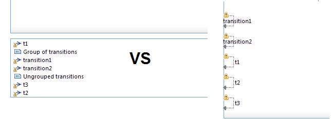

If your state diagrams look cluttered with a lot of transitions and many of them are internal transitions, it becomes challenging to work with and understand the diagrams. To make it more efficient to work with such diagrams, we introduced a preference to control how to visualize internal transitions.
By default, internal transitions are not shown in the state chart diagram inside that state, and you have to look in the state symbol one level up to see them. But if there are quite a few of them, the preferable way would be to see internal transitions for the enclosing state. The preference to control their appearance is UML Development-> Real Time-> Diagrams->State Chart->Enclosing State Internal Transitions and it has several options:
Show internal transitions in compartment below state diagram
The internal transitions will be shown in a list in a separate compartment at the bottom of the diagram (but inside the diagram frame).
Show internal transitions in compartment outside state diagram border
The internal transitions will be shown in a list in a separate compartment, which will be placed outside the bottom state diagram border. This is the recommended visualization.
These two options have benefits since they allow to work with internal transitions in a separate area, and to order them by moving transitions within the compartment. The compartment also supports drag and drop functionality from Project Explorer, and moreover has possibility to add comments inside the compartment. Comments can be used to group related transitions, and provide a visual clue for the ordering. Opening diagrams with separate compartment is faster, and makes the layout look less cluttered especially for diagrams imported from Rose RT.

All the above preferences are workspace preferences which control the appearance of a state chart diagram. They are only used when displaying diagrams which do not have their own filtering preferences. That is, a preference that has been set using the Appearance tab in the Properties view and persisted in the model (by enabling the preference Persist workspace filters) will take precedence over the corresponding workspace preference.
Do you have suggestions how to improve visual presentations of internal transitions? Mail your proposals to model-realtime@hcl-software.com.